(from http://www.globalhealthaction.net/index.php/gha/article/view/20903)
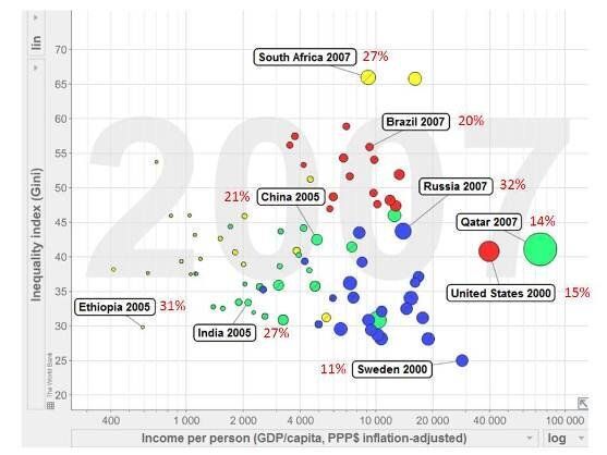
Although this chart might look a bit complex at first sight, it shows some straightforward messages. As you move from left to right, poverty reduces. As you move from bottom to top, inequality within countries increases - bigger gaps between the rich and the poor inside particular countries. The size of the bubbles that represent particular countries represents the amount of carbon emitted per person, and the red numbers next to the selected countries shows the risk of someone dying from a non-communicable disease (things like heart disease, diabetes, cancers) between their 30th and 70th birthdays - often known as a premature NCD death.
As we wrote in a Global Health Action article introducing the coming debate, not surprisingly, the richer countries (right-hand side) are generally the greater per capita carbon emitters, but they also tend to be less affected by premature NCD mortality. This shows very clearly that premature NCD mortality is not primarily a product of affluence or industrialisation. Inequality (top area) is strongly associated with some of the world's emerging economies, which also carry substantial burdens of premature NCD mortality. Poorer, low-carbon emitting populations, exemplified here by Ethiopia and India, also carry high burdens of premature NCD mortality.
Please join us in Thursday's debate. What are your visions for global health Beyond 2015? What does the world need to be putting on the agenda now to safeguard health in the future?
(originally published as a Huff Post UK Blog 02/04/2013)